Keeping it Real…with Realism
In our last episode, episode 23, we talked about realistic color tattoos, and their longevity, as well as tips on how to get you some good portraits. Here are some examples of the good, the bad, and the ugly.
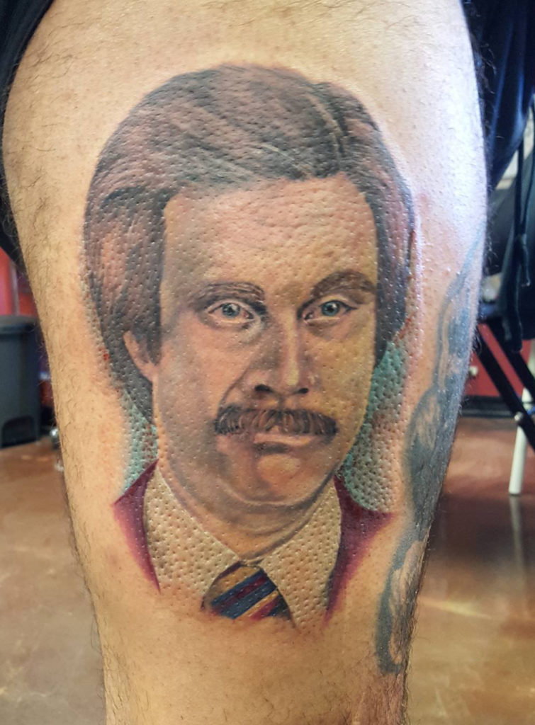
Our first example is a fresh tattoo of our friend Ron Burgundy. The issue with Mr. Burgundy is the lack of contrast. The blue background is close in tonal value to his face. His face has a lack of contrast as well – in a portrait that will last, sometimes the face might seem a little too bold when it’s fresh. This tattoo is likely going to look very washed out and hard to make out when it heals.
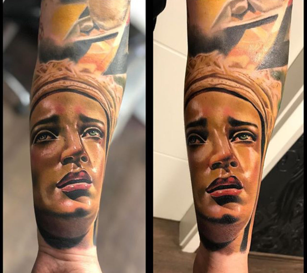
Here’s a good example of a face that looks pretty bold in color, but healed wonderfully:
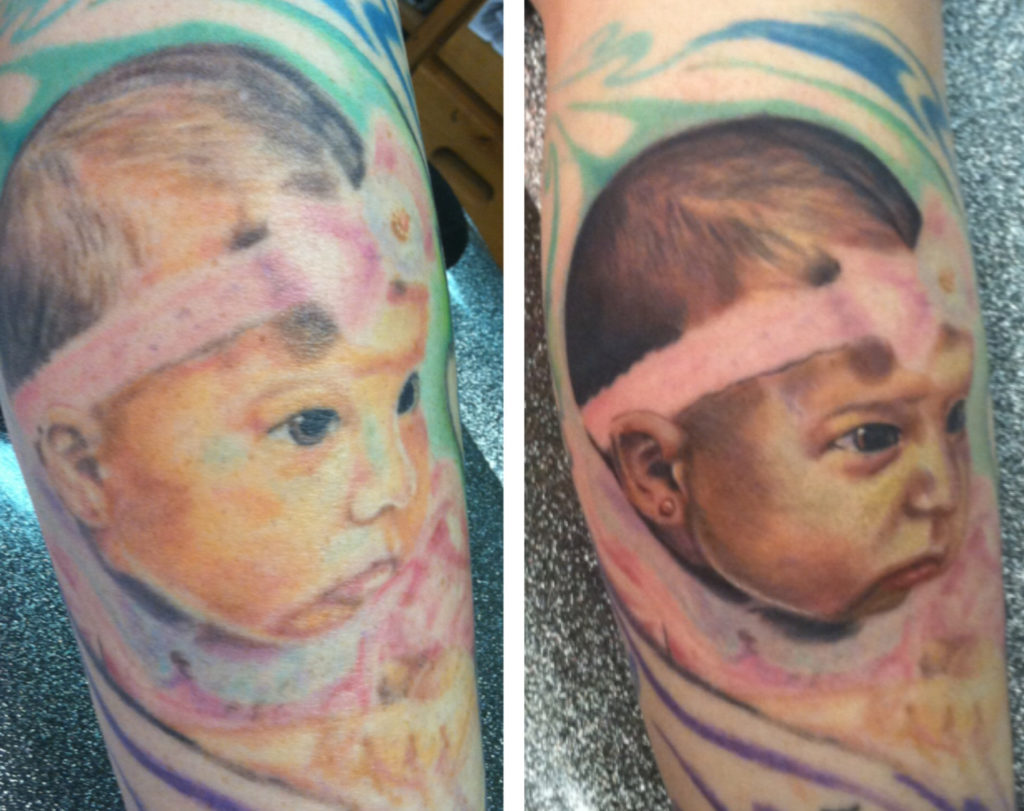
Here’s a similar example to Ron Burgundy. You can see the lack of contrast and the light background and how healing didn’t treat it well:
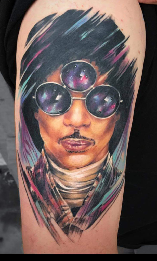
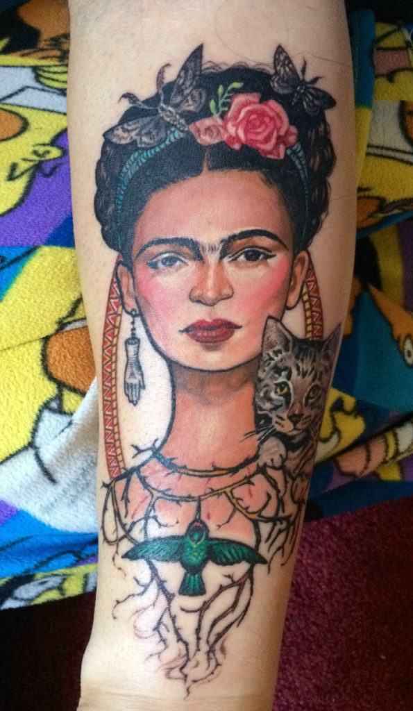
And now for some healed tattoos that had all of the elements for a good color realism piece: contrast, bold colors, and even an outline or two.

Thanks for listening and we hope this was a good companion for episode 23!
-No Regerts
0 comments